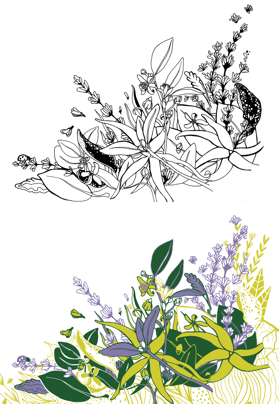
Aveda relaunched its 3 signature aroma lines and needed to renew its audience’s excitement around these refreshed classics. This was an opportunity to appeal to a new, younger millenial audience that Aveda had been hoping to gain.
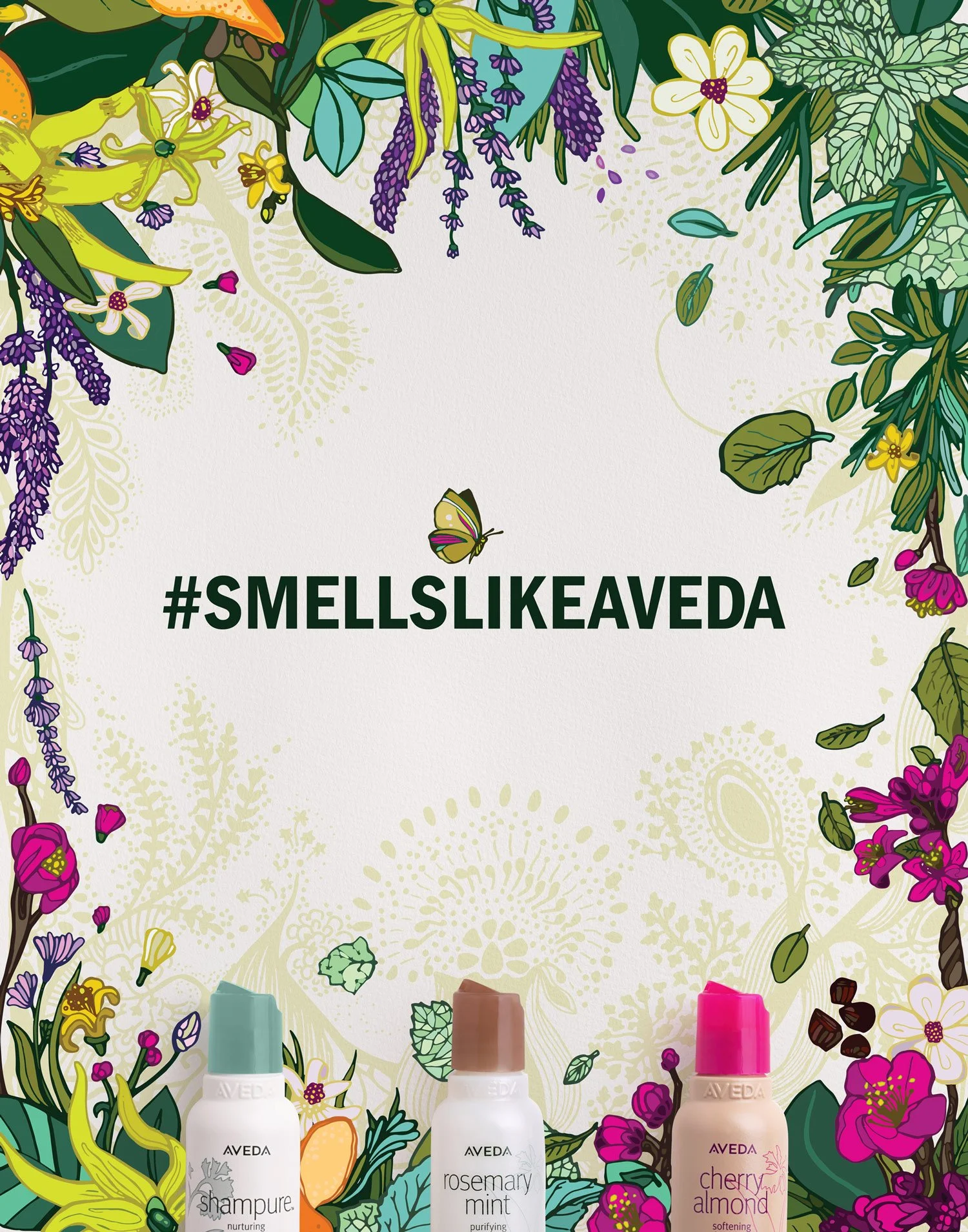
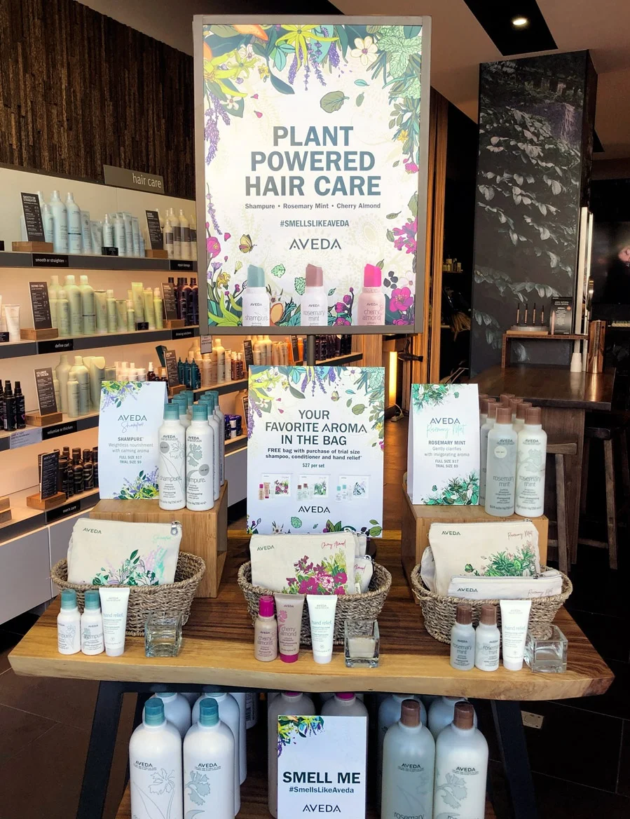
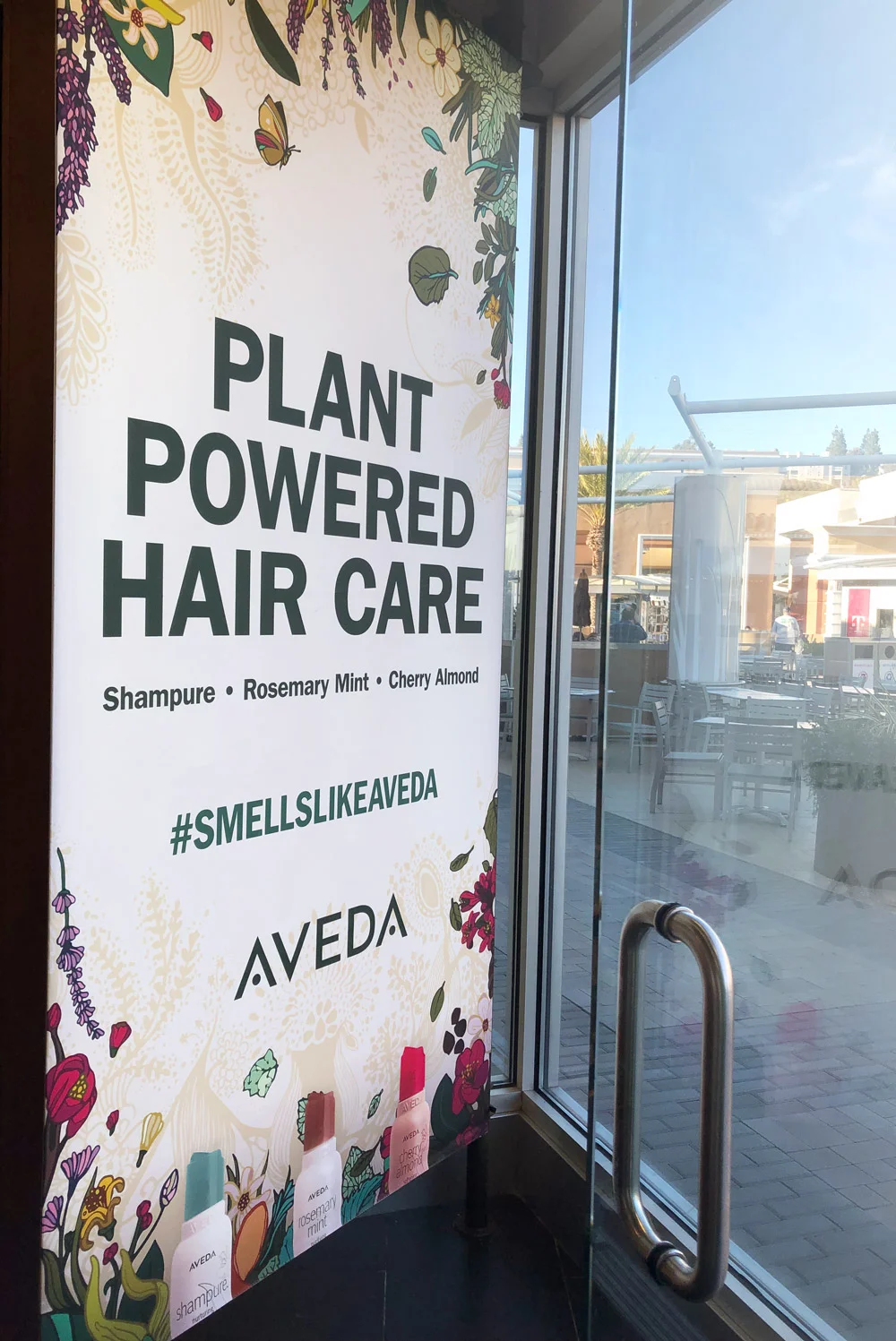
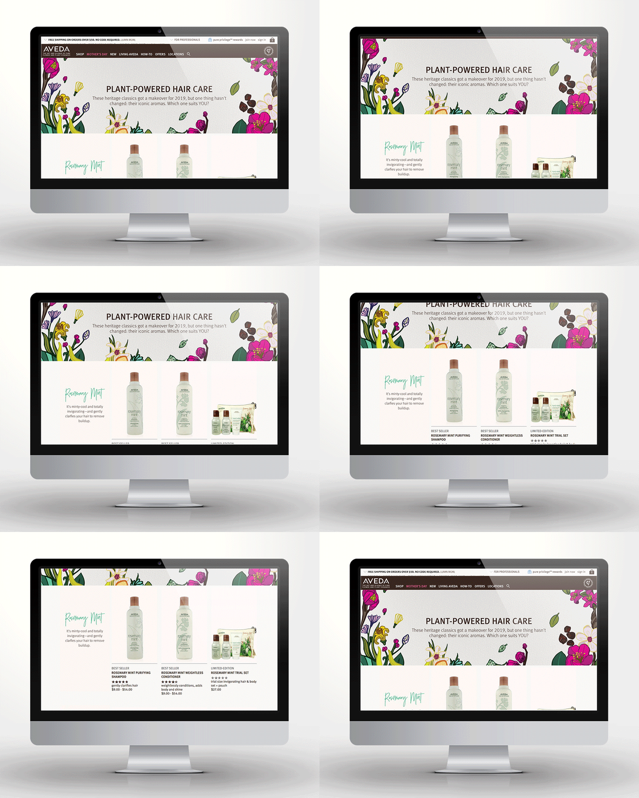
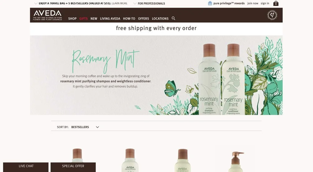
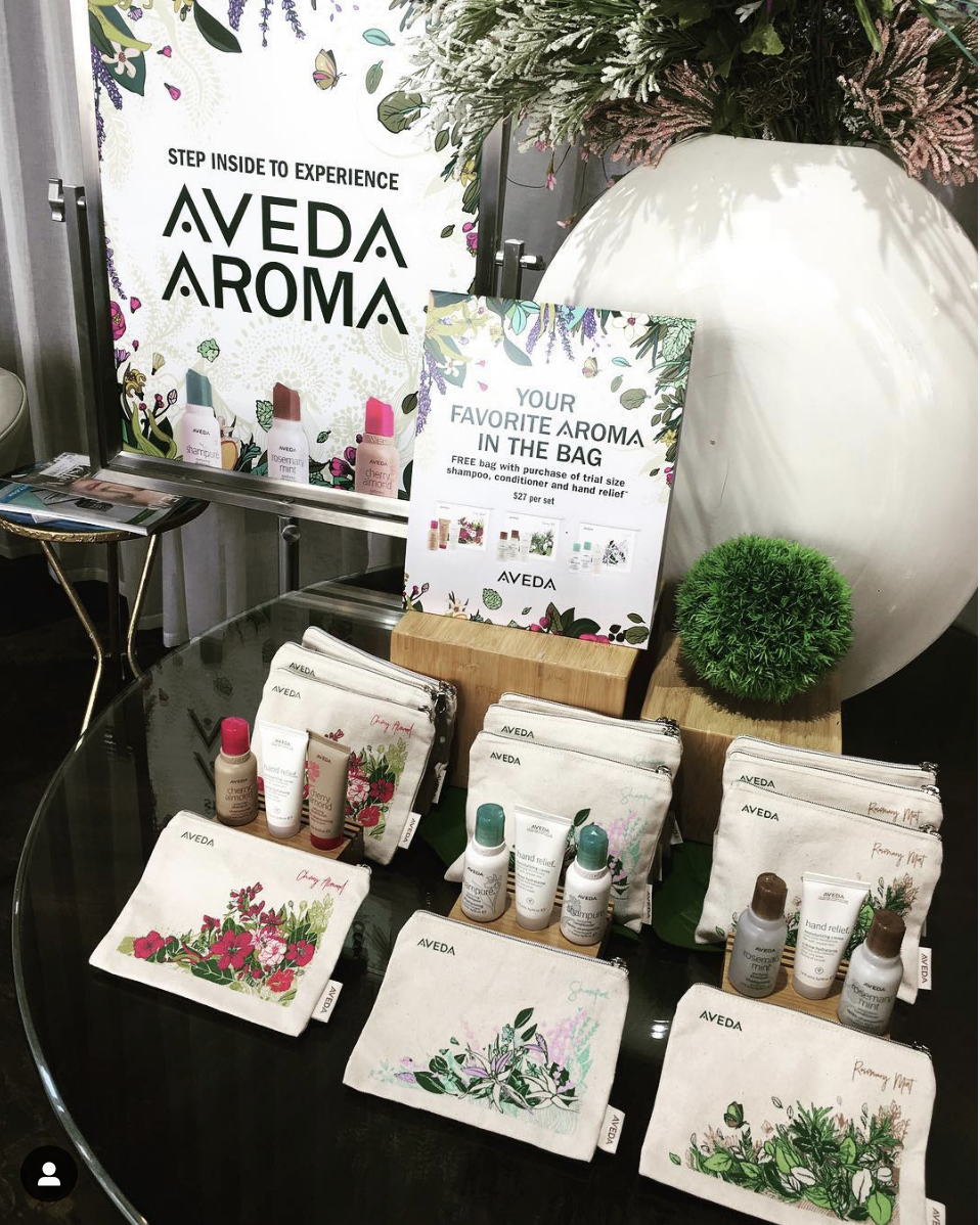
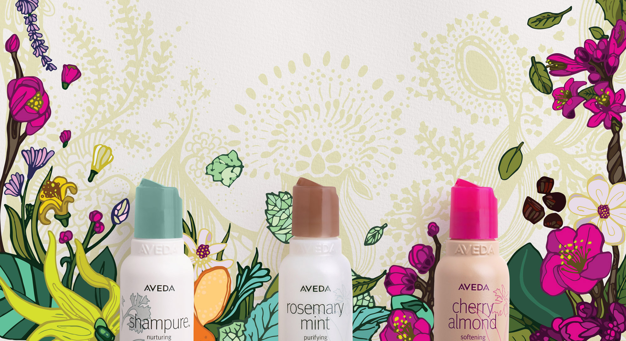
I was tasked with creating the main visuals for the “Aroma campaign.” I used bright colors and whimsical lines to catch the viewer’s eye, and then detail and layering to keep their gaze longer. Imperfection is valued by this younger demographic, so I used hand-drawn elements to give it a relatable, familiar feel.
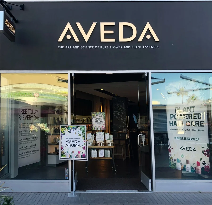
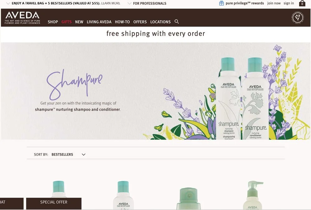
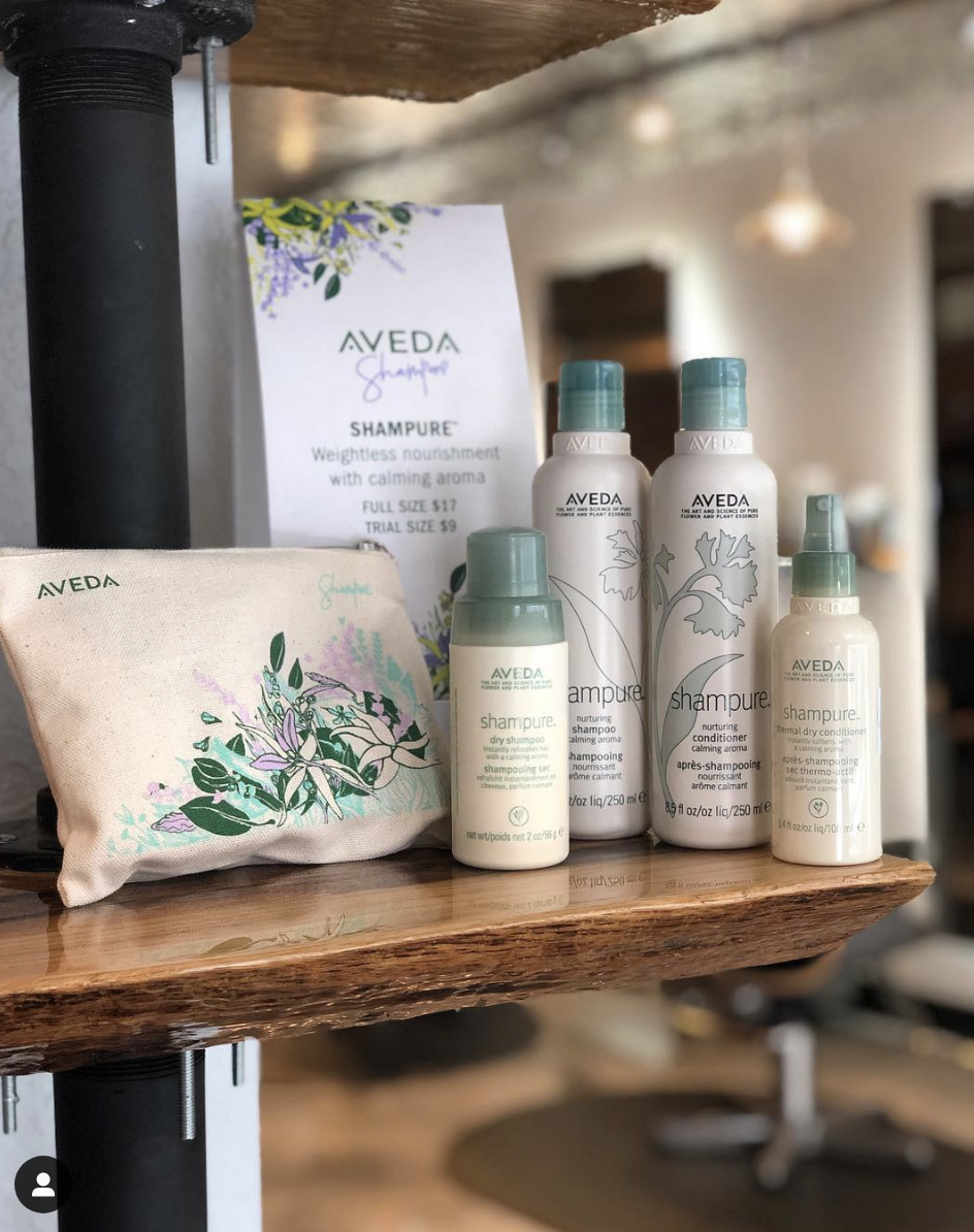
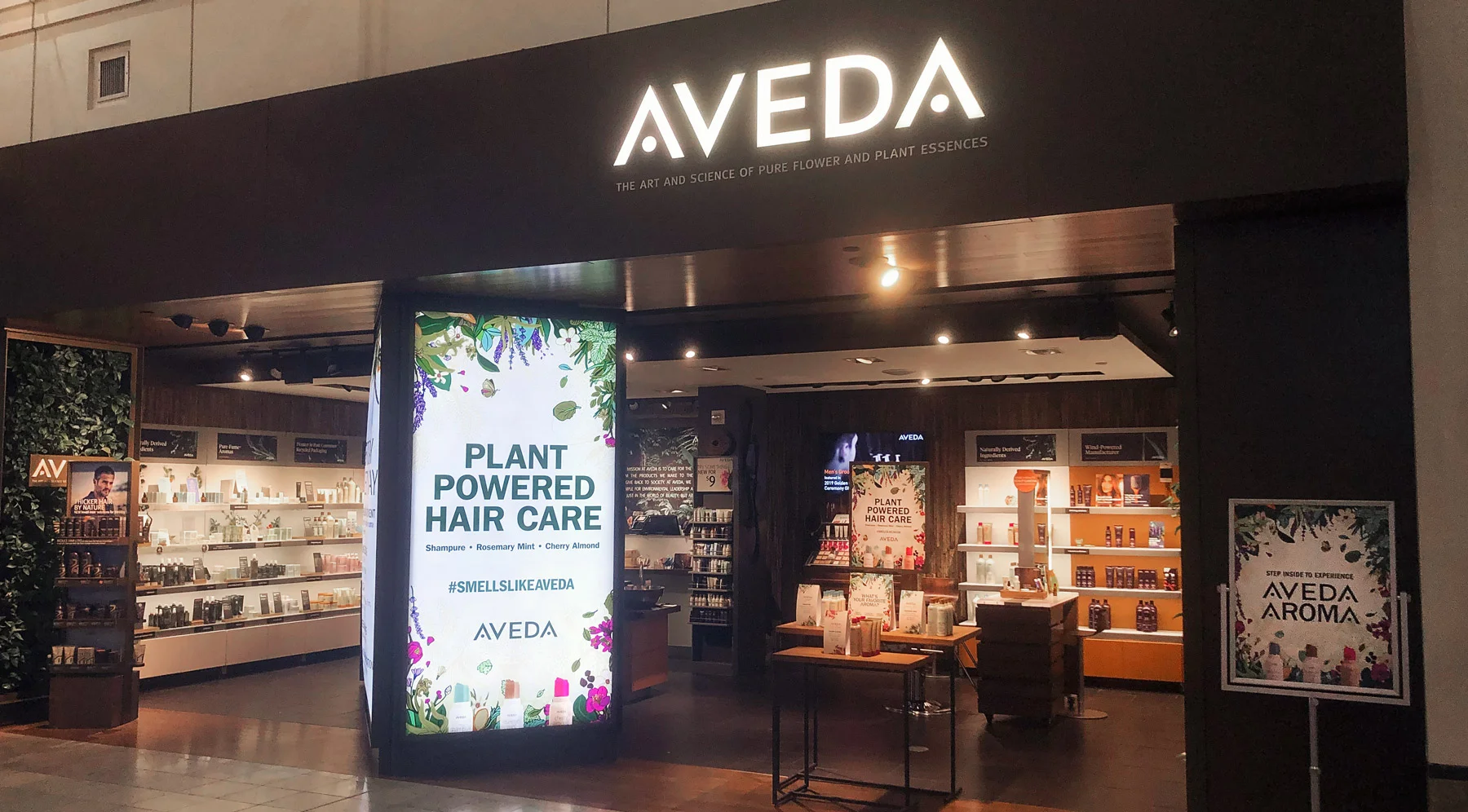
The main visual started as a poster but the artwork was so well received that it became a store and Aveda digital takeover. In addition to the illustrations, I was tasked with creating 3 product bags which were so popular they quickly sold out. Then, to bring the campaign to social platforms I was tasked with creating digital gif components via giphy which have currently been used over 123 million times.
See below for other pieces of the campaign.
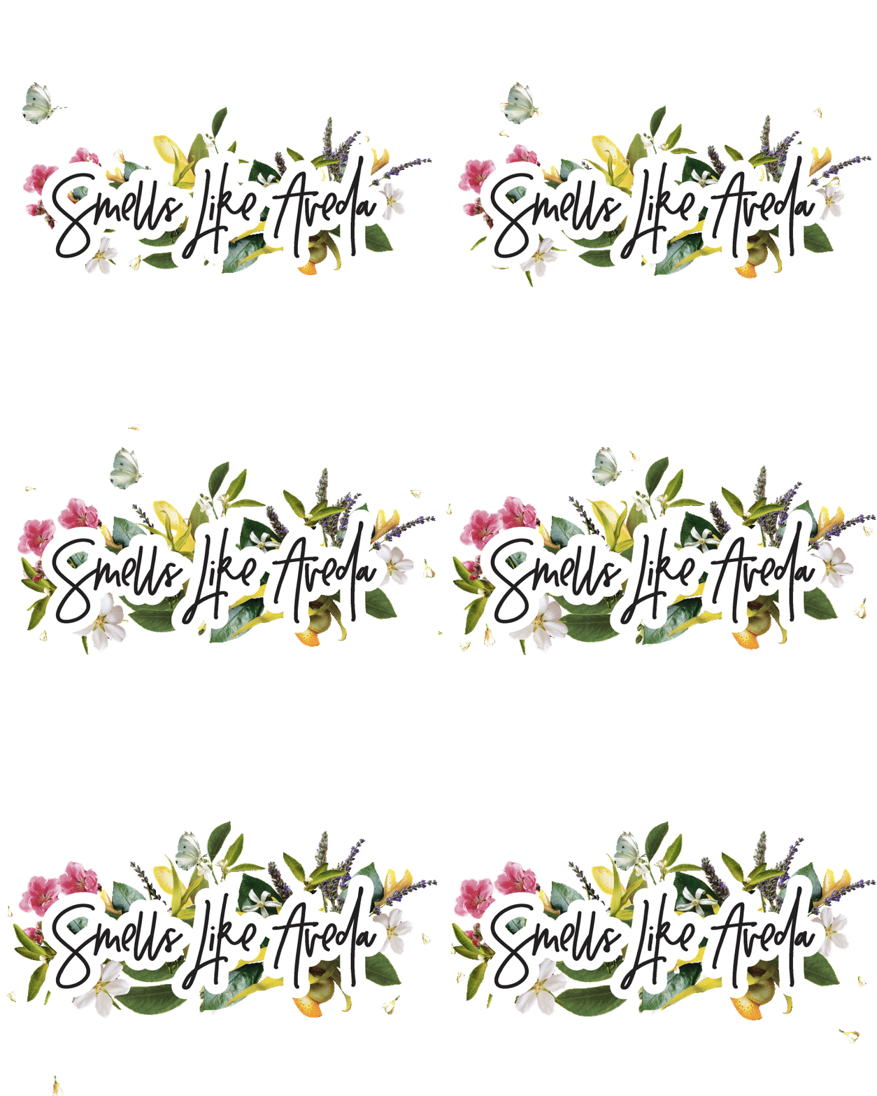
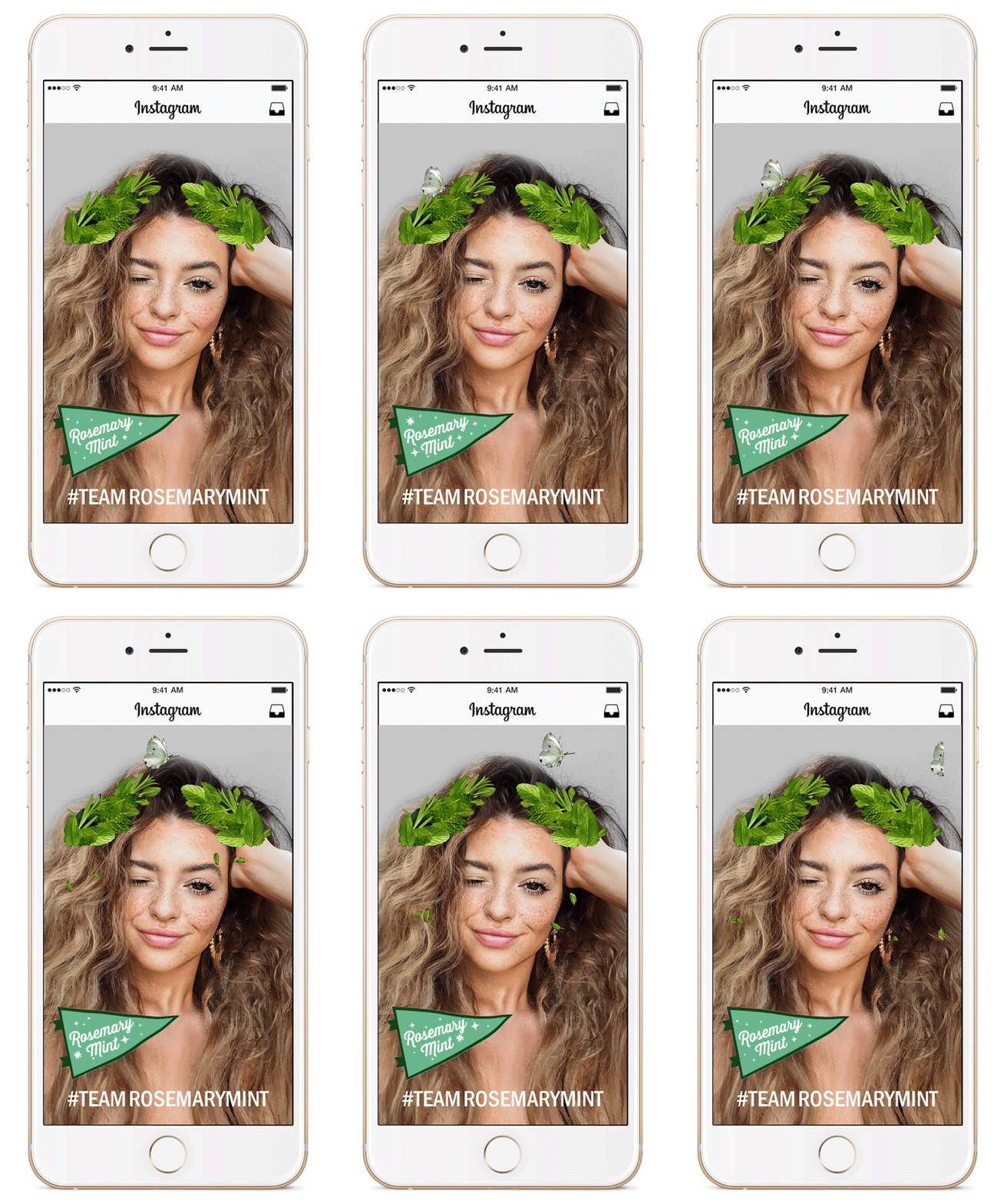
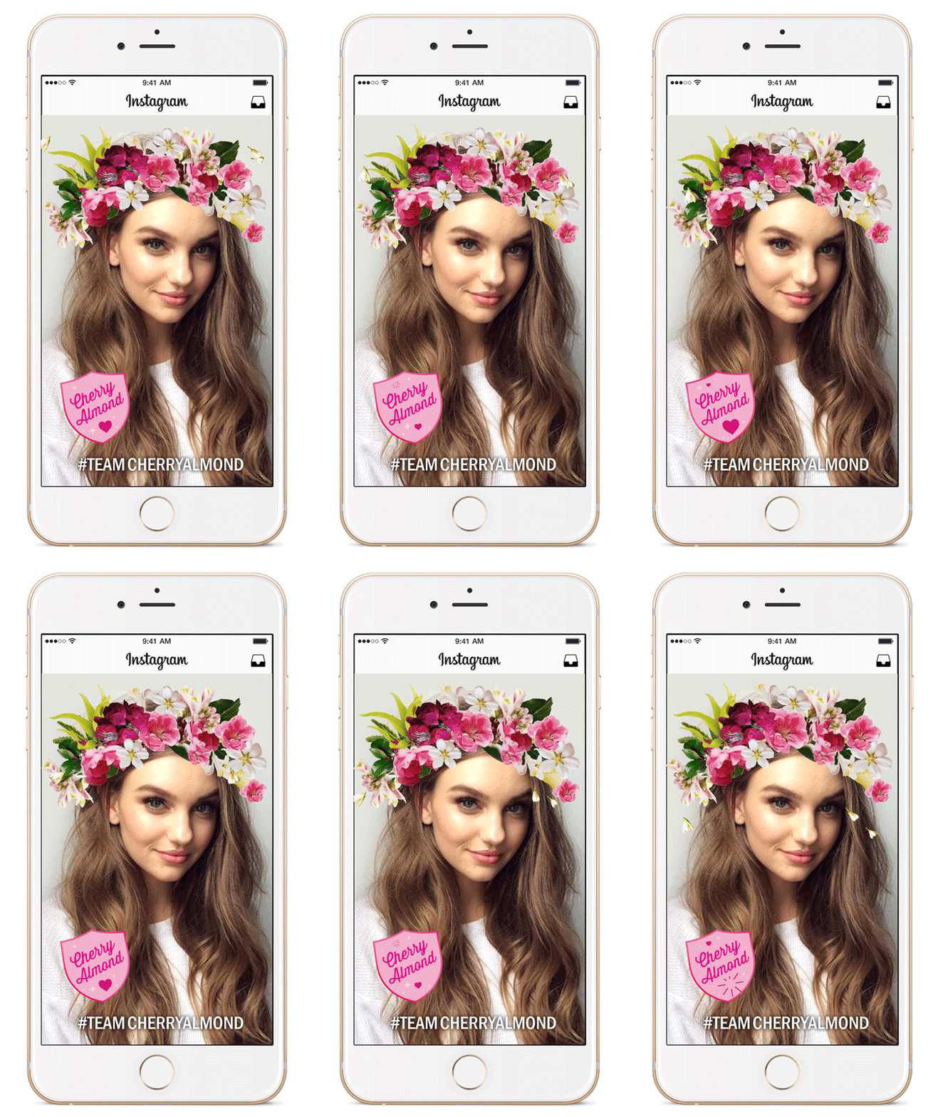
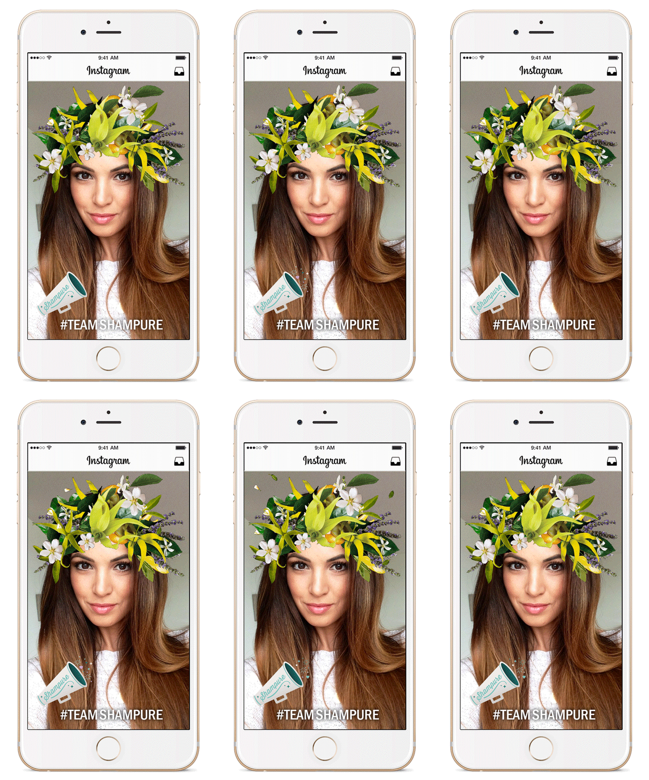
As a social component of the campaign, I was tasked to create 12 Aveda-branded animated gifs that could be used as stickers by Instagram users. As giphy was a new account for the brand, it was my job to create visuals that bridged the refined branding of Aveda with the fun, irreverent aesthetic of gifs.
It took a few iterations of trial and error to create a beautiful, polished and well-working product. But eventually, my co-animator and I created a library of giphy stickers that were wildly successful and are still used regularly by Instagram and giphy users across the world.
Some stickers have been used over 31 million times
and the giphy sticker collection has been used
over 123 Million times in total.
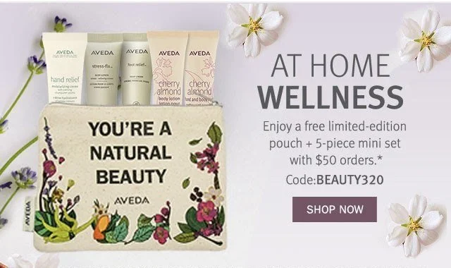
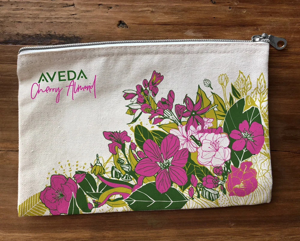
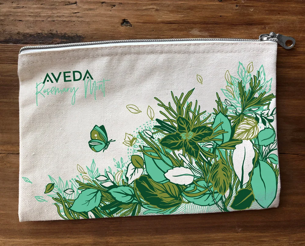
As a purchasable campaign element, bags filled with travel-sized products were sold in-store and online. I concepted, hand-illustrated, and designed 3 travel bags that were loved by customers and the Aveda team alike.
